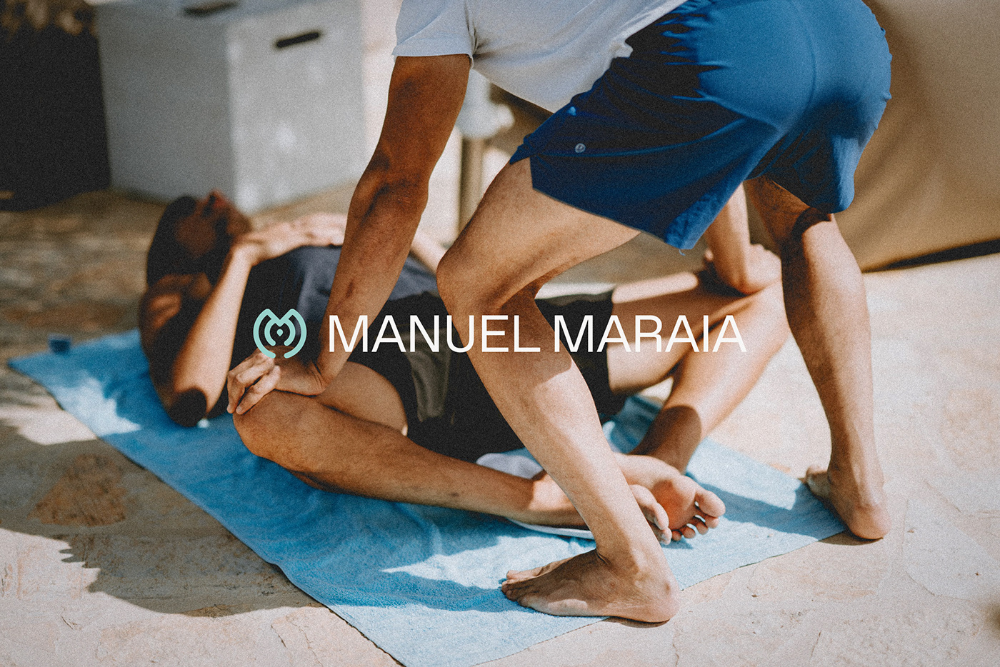
Manuel Maraia
Brand Identity
The Client
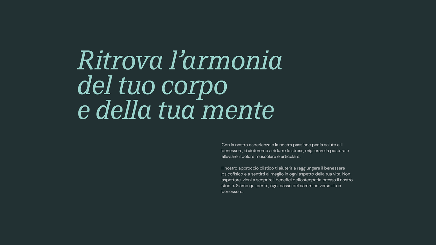
Manuel Maraia, an experienced and dedicated osteopath, approached us with the objective of developing a distinctive and impactful brand identity for his practice. As an accomplished professional in the field of osteopathy, Manuel sought to create a strong visual presence that would resonate with both existing and potential clients, conveying a sense of trust, reliability, and expertise.
The Objective
Manuel approached us with the objective of developing a distinctive and impactful brand identity for his practice. As an accomplished professional in the field of osteopathy, he sought to create a strong visual presence that would resonate with both existing and potential clients, conveying a sense of trust, reliability, and expertise.
The Outcome/solution
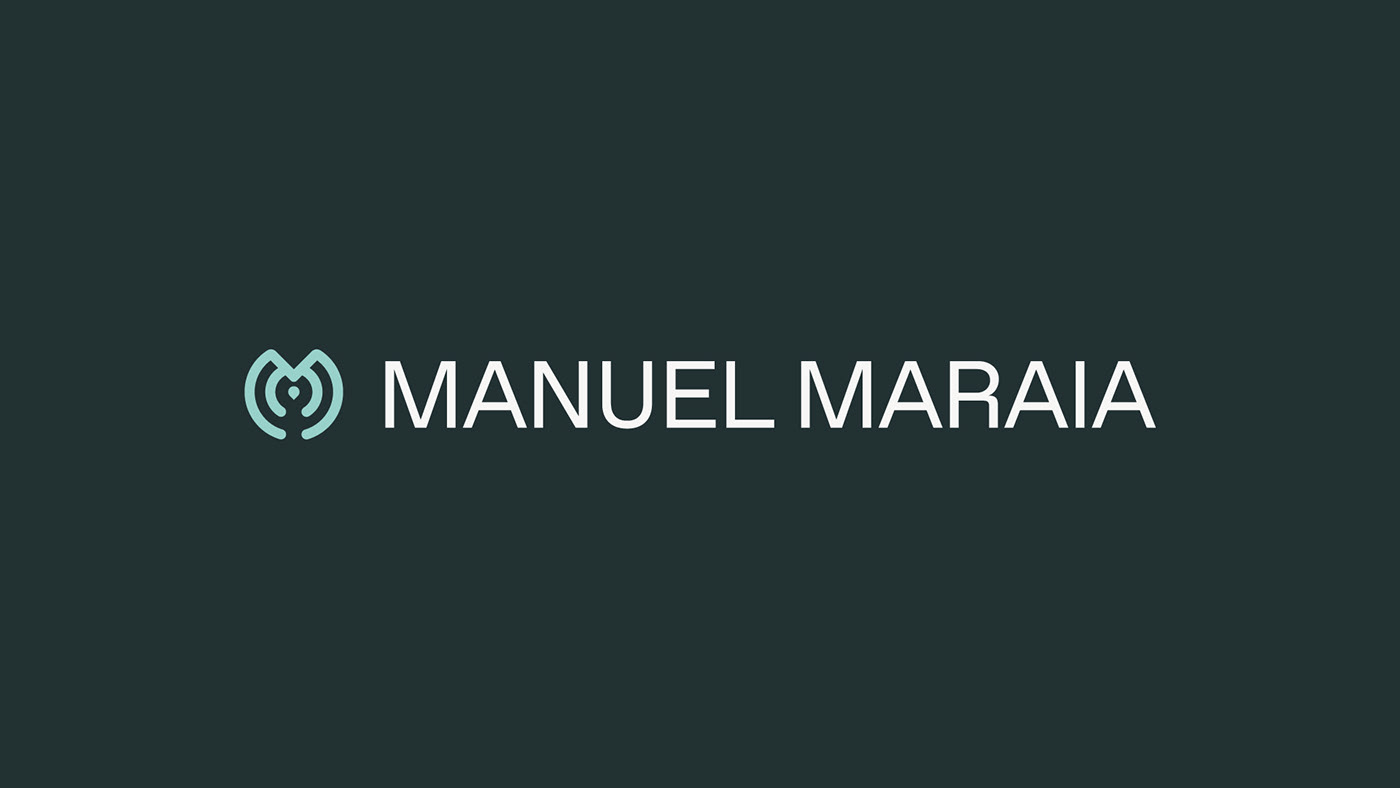
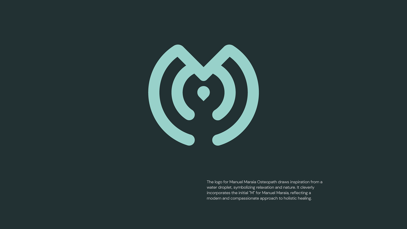
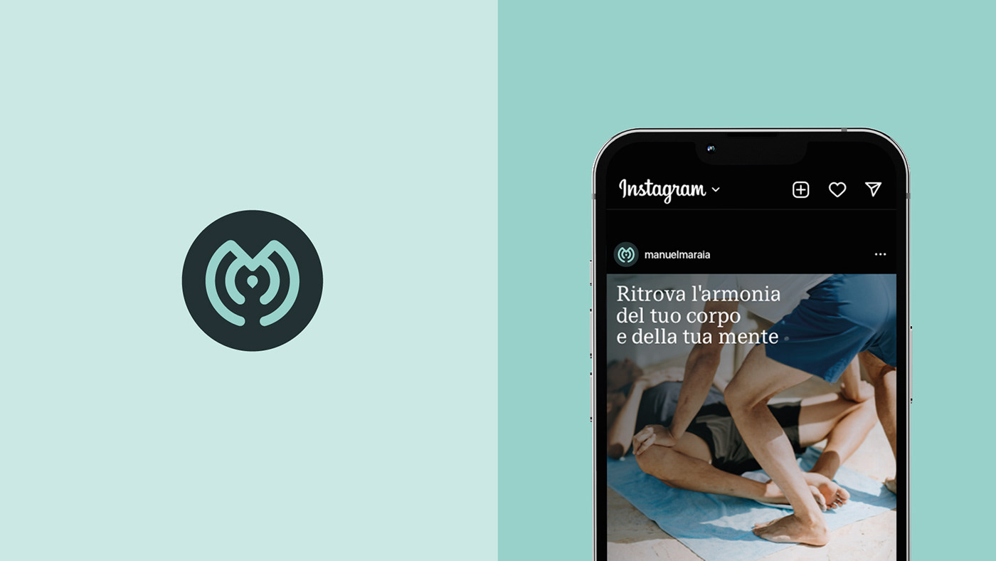
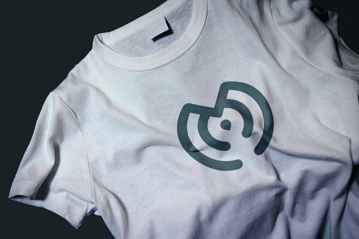
The centerpiece of the brand identity was the logo - a visual symbol that would serve as an enduring mark of Manuel's practice. We focused on designing a logo that would be visually captivating and memorable, leaving a lasting impression on clients' minds. The chosen Sans Serif typography added a touch of modernity and sophistication, reflecting Manuel's dedication to staying up-to-date with the latest advancements in osteopathy.
The color palette was carefully curated to evoke a sense of vitality and energy associated with a healthy and sporty lifestyle. Greens and calming blues symbolized nature, growth, and tranquility, fostering a positive association with the brand.
Year 20203
↓↓


© 2023 Be.Family
Leave a comment ↓↓

